Funeral Program Fonts
Creating your own funeral program can help you create a personalized keepsake to help honor the memory of your loved one. Besides gathering all the needed information for your funeral program, including the funeral and burial plans, funeral program order of service, poems, and personal inforamtion about your loved one, you also need to choose a funeral program design that represents your loved one's. Part of this process is selecting the program’s font.

Many novice designers spend a countless amount of time trying to pick out the best font for the funeral program they’re creating because the choices seem endless. However, deciding on the right typeface is a combination of intuition and experience, with a few design rules thrown in for good measure. You want to present a lovely funeral program design, but you don’t want to under- or overdue it.
Guidelines for Selecting Funeral Program Fonts
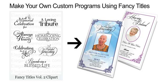
When choosing funeral program fonts, make sure you spend a little time actually seeing how a specific font looks on a page. Take your time and select one that reflects your loved one’s personality, as well as the overall feel of the funeral or memorial service. When in doubt or are short on time, use a font which you are most comfortable using. If you have purchased a funeral program template, the fonts are already selected and formatted for you. You may, however, decide to change the font. These guidelines can help you select a different type of funeral program font.
Tips for Funeral Program Font Selection
Make Sure the Font is Applicable
Funeral program templates come with the text in a default font. You can always stay with this style or select one of your own liking. Make sure to choose one that isn’t too fancy, gaudy, bold or simply just inappropriate. Some commonly used fonts include Book Antiqua, Century Schoolbook, Copperplate Gothic, Franklin Gothic Book, Helvetica, Verdana or Arial.
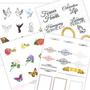
View our Borders and Titles Clipart
" class="link-button button-green">View our Borders and Titles Clipart
Promote Readability
You want the text in your funeral or memorial program to be readable. Tiny font sizes, ugly fonts or those with crammed line height are not pleasing to the readers’eyes. You have many things to say about your loved one and his or her funeral service, so you want to make sure guests have no trouble reading it all.
Be Consistent with Your Pairing
You don’t necessarily have to use the same font in the entire memorial or funeral program especially if it has a lot text. This is where you will want to pair up two or more fonts that complement each other. Use one font for larger headers and then a different for the text itself. There isn’t a science to figuring which two fonts go together; users will just have to try them all to see the ones that go together.
Watch the Font Size
As a rule of thumb, most body copy is at least 12pt, although many find 14pt. fonts to be more readable. Just make sure you don’t make it too small where people are squinting to read it, but not too large as to not have enough room throughout the program. Make sure you are consistent with the font size throughout the program.
Match Your Program’s Design
The funeral program’s typography should match the overall design of your program from the color theme to the images selected. Too many fonts styles and sizes will take away from the elegance you are trying to create.